
Introduction
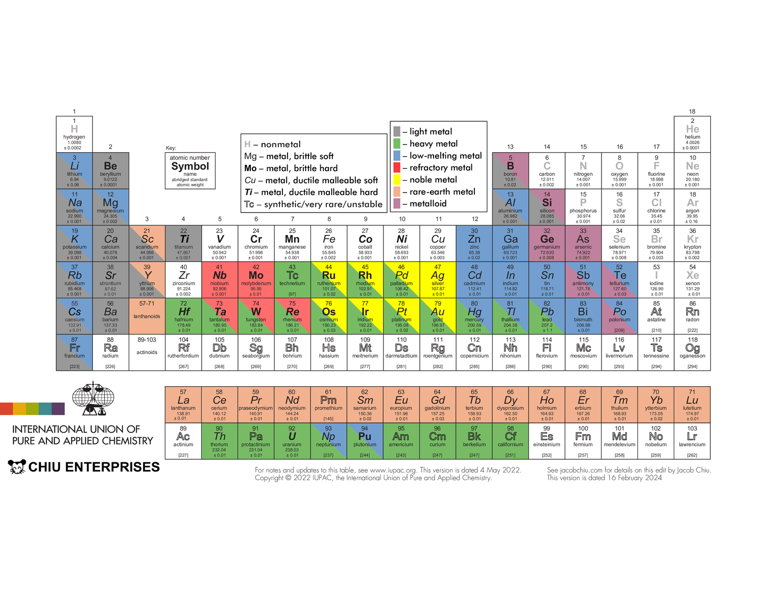
I have a … thing for the periodic table. In elementary school, I copied it twice, by hand, of my own volition. The first attempt was crooked with many spelling errors and multiple different pen colors. The second was neater, but element 8 was still written as “oxegen”. Last year, in the never-ending quest to discover an “ideal” periodic table that has all the information you need, yet is easily readable and printable, I took the one from the International Union of Pure and Applied Chemistry and edited it.
The IUPAC’s periodic table is available here. Americans: note that elements 13 and 55 are spelled aluminium and caesium, though “aluminum” and “cesium” are also technically accepted. Also note that the f-block elements are called lanthanoids and actinoids rather than lanthanides and actinides — the “-ide” ending implies something is an anion (ex. fluoride, oxide). Anyways, you can see that the table is very simple, displaying only each element’s full name along with its atomic symbol, number, and mass. These values are easily readable even when the entire table is printed on a single piece of paper. The main reason I chose to edit this specific table was because of its accessibility: a .pdf file was freely available online and the table’s simplicity also made it easy to modify. Also, of all organizations providing periodic tables, the IUPAC seems the most legitimate; it’s the international organization that governs chemistry.
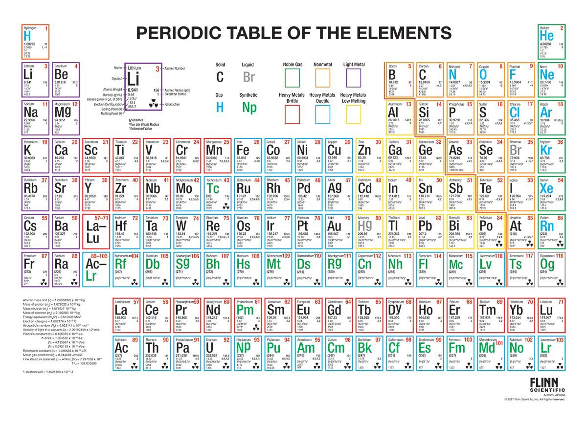
A table I took inspiration from was this one from Flinn. I liked its use of color to display physical properties like density, ductility, and state of matter, though the written information for each element was too small to be easily readable. Also, its categorization of metals into either “light”, “heavy brittle”, “heavy ductile”, or “heavy low-melting” is somewhat problematic as elements can have other combinations of those properties.
Design
My design uses two methods to display element properties. First, the formatting of an element’s atomic symbol shows its mechanical properties: bold indicates hardness while italics indicate malleability and ductility. For example, an element with no formatting is soft and brittle, like bismuth. A bold, italicized symbol shows hardness, malleability, and ductility, like vanadium. Additionally, a grey symbol denotes a nonmetal while an outlined symbol denotes that an element is synthetic, very rare, or unstable (i.e. its radioactivity is the only thing of interest to humanity; eg. no one cares what the mechanical properties of radium are).
These properties are taken from a broad survey of qualitative data from various internet-based sources (mainly Wikipedia) rather than quantitative data like Moh’s hardness. They should be mostly correct, with two caveats: lead is very malleable but only somewhat ductile, and cobalt is ductile but only somewhat malleable.
Other physical properties are shown through color. An element highlighted grey is light, while a green one is heavy, a blue one is low-melting, a red one is refractory (high-melting), a yellow one is noble, an orange one is a rare-earth, and a magenta one is a metalloid.
- All elements with a density at or less than 5g/cm^3 are considered light — this definition is taken from Wikipedia
- All elements with a density at or higher than that of lead (11.34g/cm^3) are considered dense
- All elements with a melting point at or lower than that of aluminium (660.3 °C) are considered low-melting
- Niobium, molybdenum, tantalum, tungsten, and rhenium are refractory metals — this is the most common definition
- Ruthenium, rhodium, palladium, silver, osmium, iridium, platinum, and gold are noble metals — the most common definition
- all the lanthanoids, plus scandium and yttrium are rare earths — the most common definition
- Boron, silicon, germanium, arsenic, antimony, tellurium, and polonium are metalloids — the most common definition
Note that while some noble metals, like osmium, have melting points exceeding some of the refractory metals, they are most often used for their inertness instead of their high melting points, so they are categorized as noble metals.
Execution
I downloaded the latest .pdf file from the IUPAC website and opened it in LibreOffice Draw. That’s all you need to do to begin editing! Note that you need to have the fonts used in the .pdf installed on your computer.
If you want to know what exactly I did, look at the .odg file I’ve linked. An image is worth a thousand words, and it’s pointless for me to describe in text my procedures when you can just look at them.
Here’s something interesting I learned while doing this project: Although LibreOffice has a maximum resolution of 0.01″ when moving and scaling shapes, you can achieve a higher resolution by adding a border to your shape of the same color as its fill, increasing its size by a tiny amount. Since border weight can be adjusted in increments of 0.1 pt (1/720 inch), this allows you to tweak the size and position of shapes very precisely.
I’ve also created a .pdf with the table split into 3 sections, each fitting on a sheet of 8.5″×11″ portrait-oriented paper. To assemble, cut along the dotted lines, then glue the center piece over the protruding flaps of the left and right pieces.
I am a human being capable of making mistakes. I am not a graphics designer, nor am I a chemist. If you find an error in my work, PLEASE tell me. It helps improve this project.
Copyright
I am aware that the IUPAC periodic table is copyrighted. The IUPAC is a great organization and I respect them. However, there is such a thing as fair use. Since I used this periodic table for educational reasons, my usage is significantly transformative, my usage has no effect on the market value of the periodic table, and I have no money, which makes it uneconomical to sue me, I think this project is fine. The reason I put off posting this project on the internet was out of fear of violating copyright.